Formosa Sports is a local Taiwanese sports e-commerce brand that entrusted us with a complete rebranding of its identity. We embedded the silhouette of the island into the logo and infused it with rhythmic energy—capturing the pulse of movement and forming a distinctive mark unique to Formosa Sports. From graphic extensions to branded merchandise, every touchpoint was led and crafted under our direction

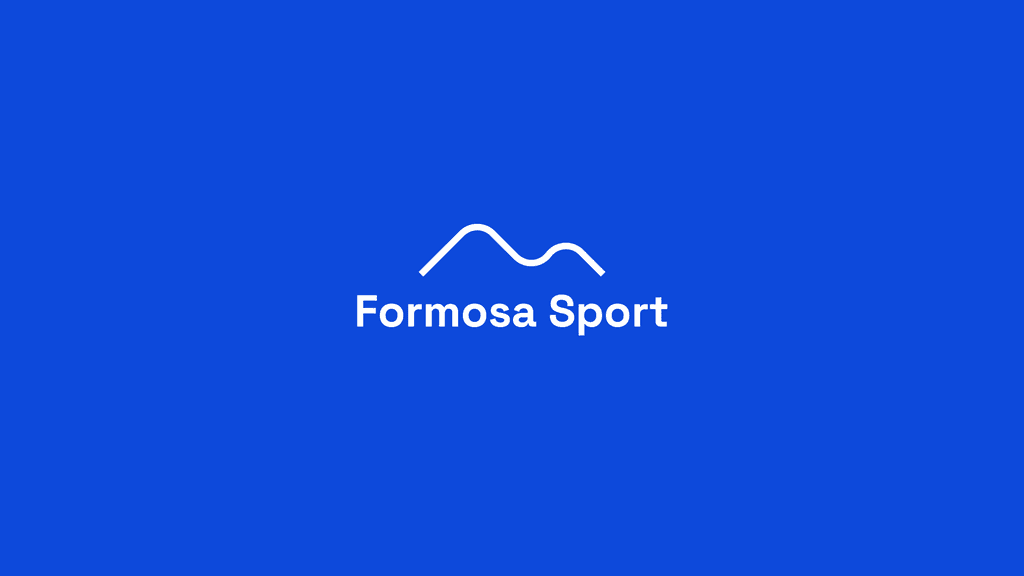
Inspired by the ridgelines of mountain landscapes, the rhythm of athletic movement, and the graceful curves of a healthy body, the design captures a balance between strength and flow. These elements form the foundation of a dynamic visual identity — one that echoes motion, resilience, and clarity. It's not just form—it’s momentum, shaped by purpose and elevated by nature.

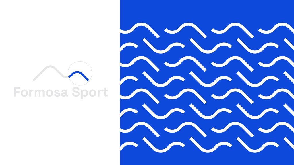

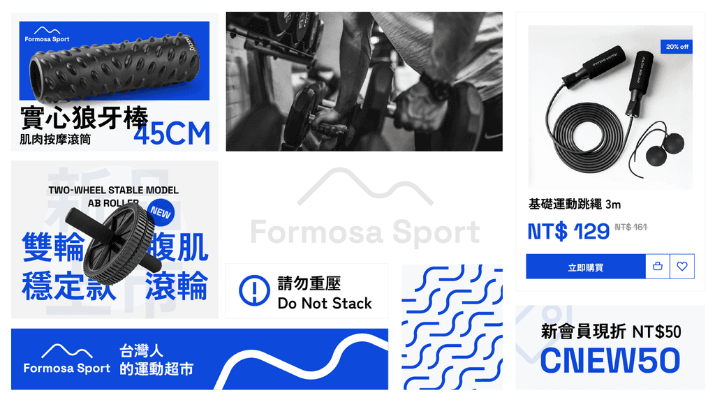
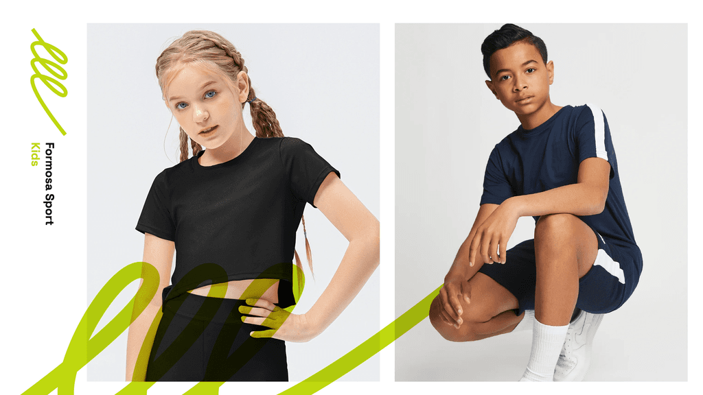
The visual identity extends beyond the logo — translated thoughtfully into the website, printed materials, and various brand applications. From digital touchpoints to tangible outputs, every detail reinforces a cohesive brand language rooted in energy, clarity, and modern simplicity.


More works